
I’m a really detail oriented all or nothing kind of guy. Unsurprisingly, when I decided to get back into 40k a number of years ago, I approached it really methodically. Before I took the plunge and bought any paints I spent a long time on the drawing board trying to come up with a color theme that would look good on the tabletop, but also blend the color styles that I really liked in other models. My goal was something with white that could work for Iron Warriors, but clean and contrasty enough to feel that they are are organized and that never truly fell to chaos. You know. What everyone wants. I wanted something unique.
So I studied a lot of painting schemes. A lot. Here are the ones I drew the most inspiration from:
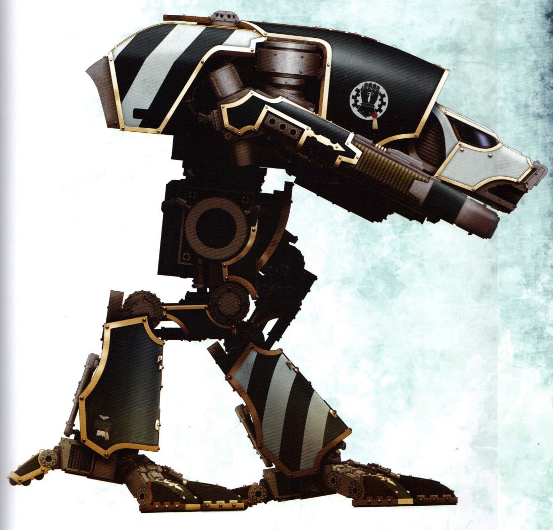
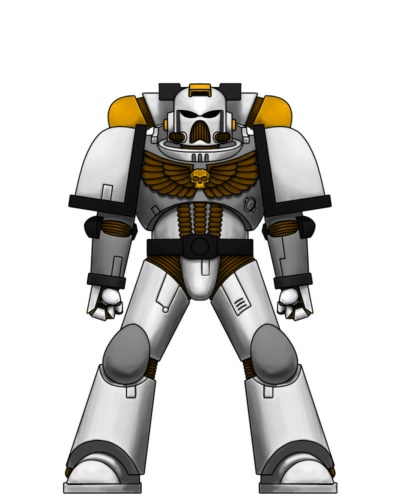
The Legio Crucius from Ryza has a theme that is, in my opinion, gorgeous. The grey black contrasted with a greenish grey and white stripes seemed like a great place to start for a clean Iron Warrior theme. I decided to do something in that palette, but not a direct copy.
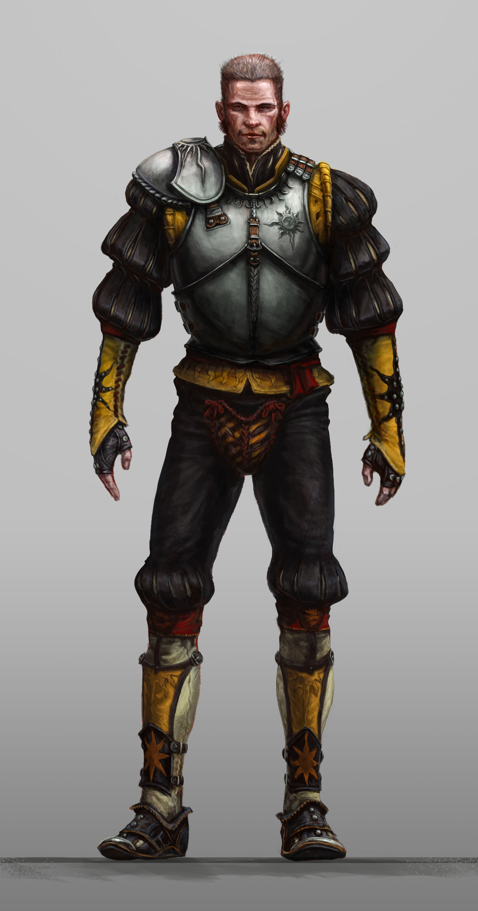
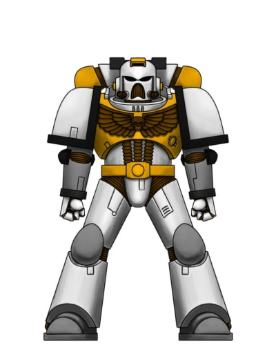
The Red Scorpions had a color theme similar to the Legio Crucius, so naturally I really liked how they stood out on the tabletop, but I preferred the mustard yellow I used for my very first iron warrior test models. That second piece of concept art reinforced in my mind that those colors- along with some red, brown, and green- could look really neat.
So… I made a ton of digital color tests. A metric shit ton:
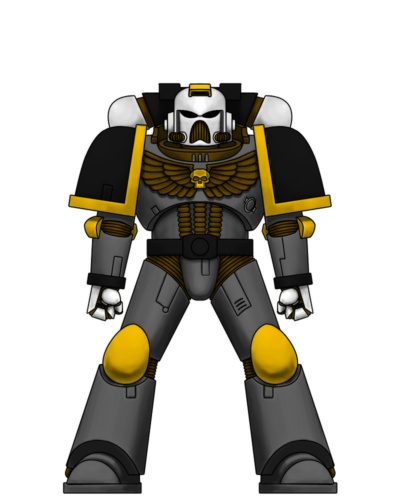
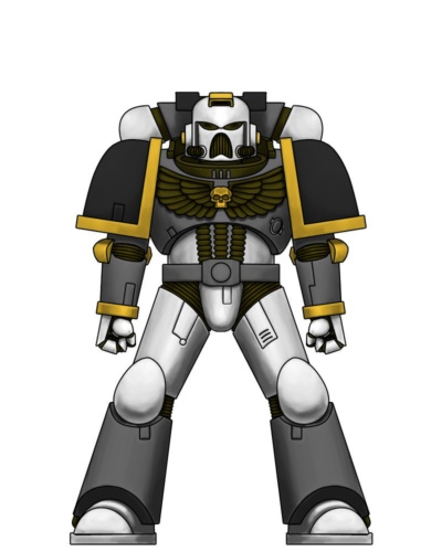
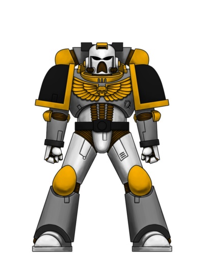
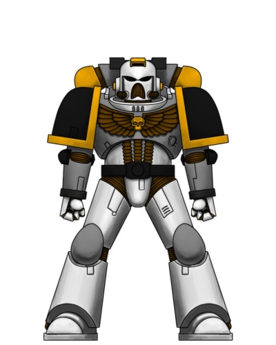
STOP HERE
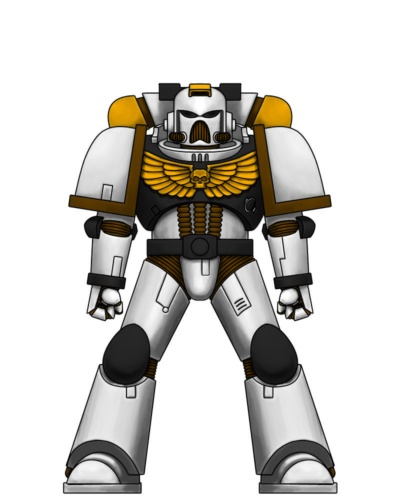
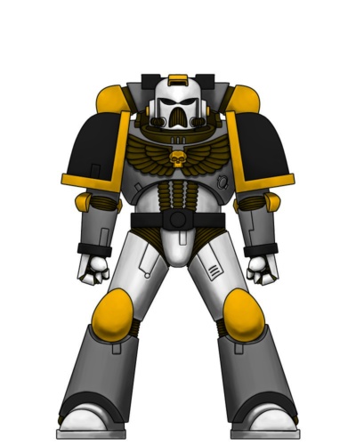
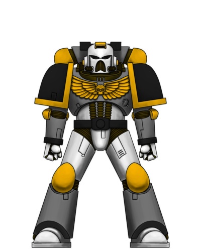
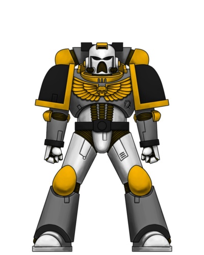
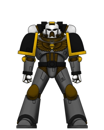
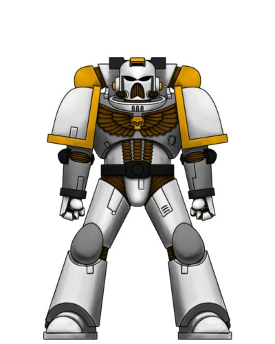
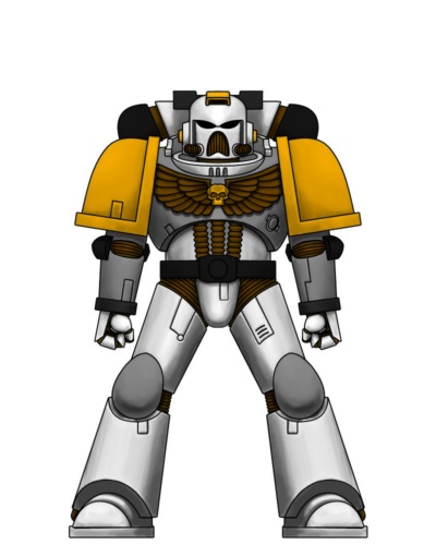
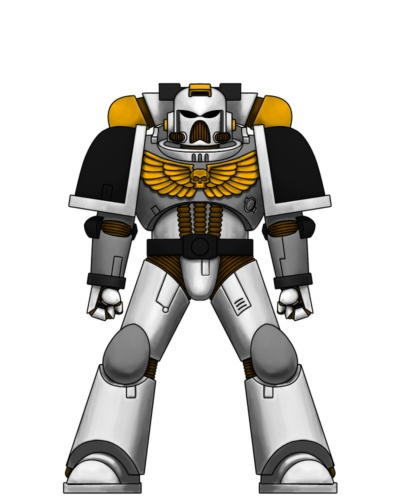
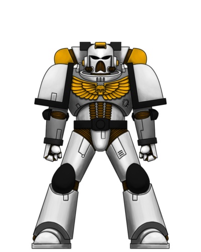
Like I said, I’m pretty meticulous. So, from this giant list, I narrowed things down to 3 themes, which I then decided to try out in some early painting experiments:
I’m glad I did, because where the rubber hits the road really matters in terms of painting. A theme you have on paper isn’t the same as what it looks like in real life. Here’s the first of those early tests taken from an ancient phone camera:
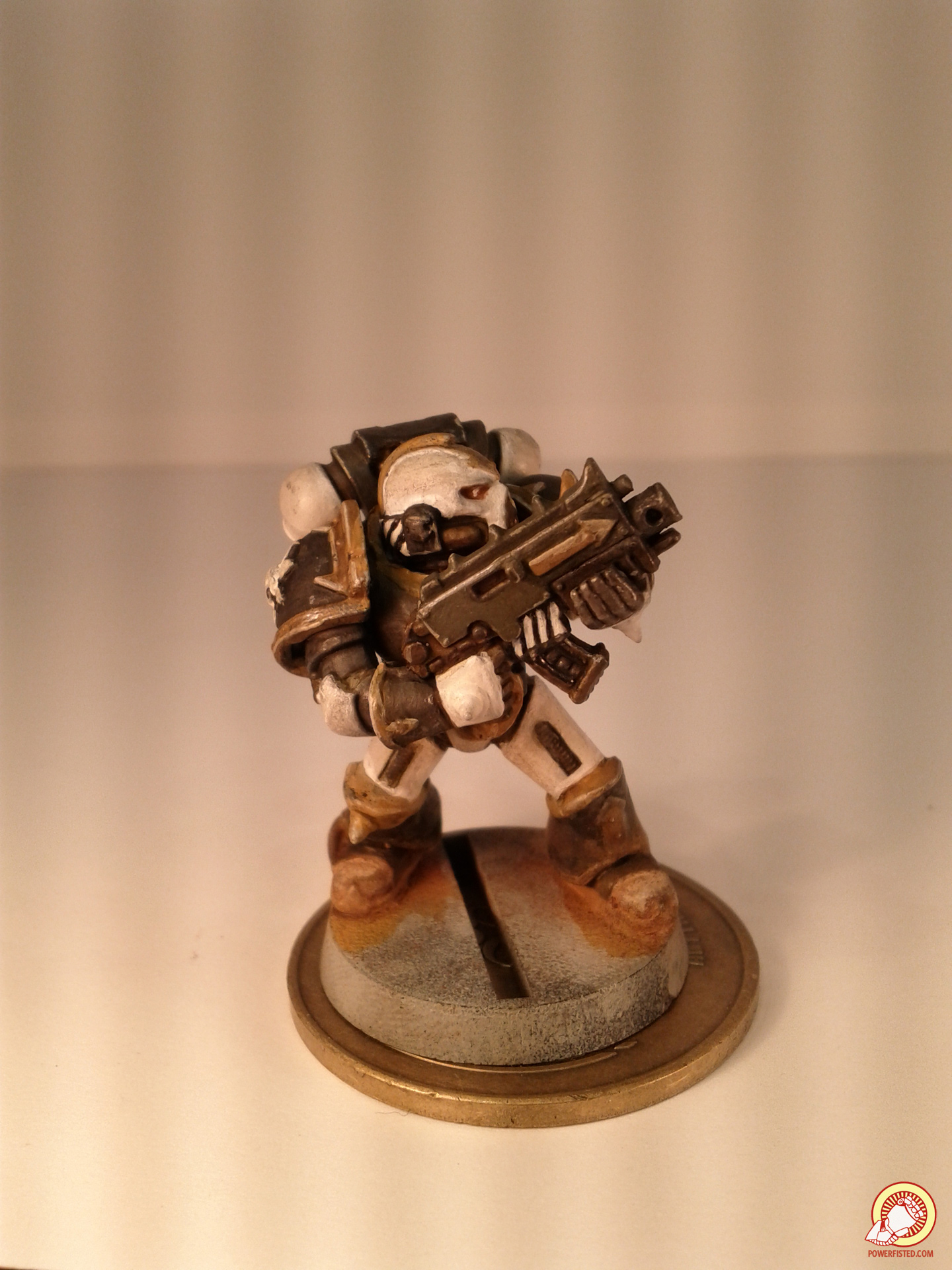
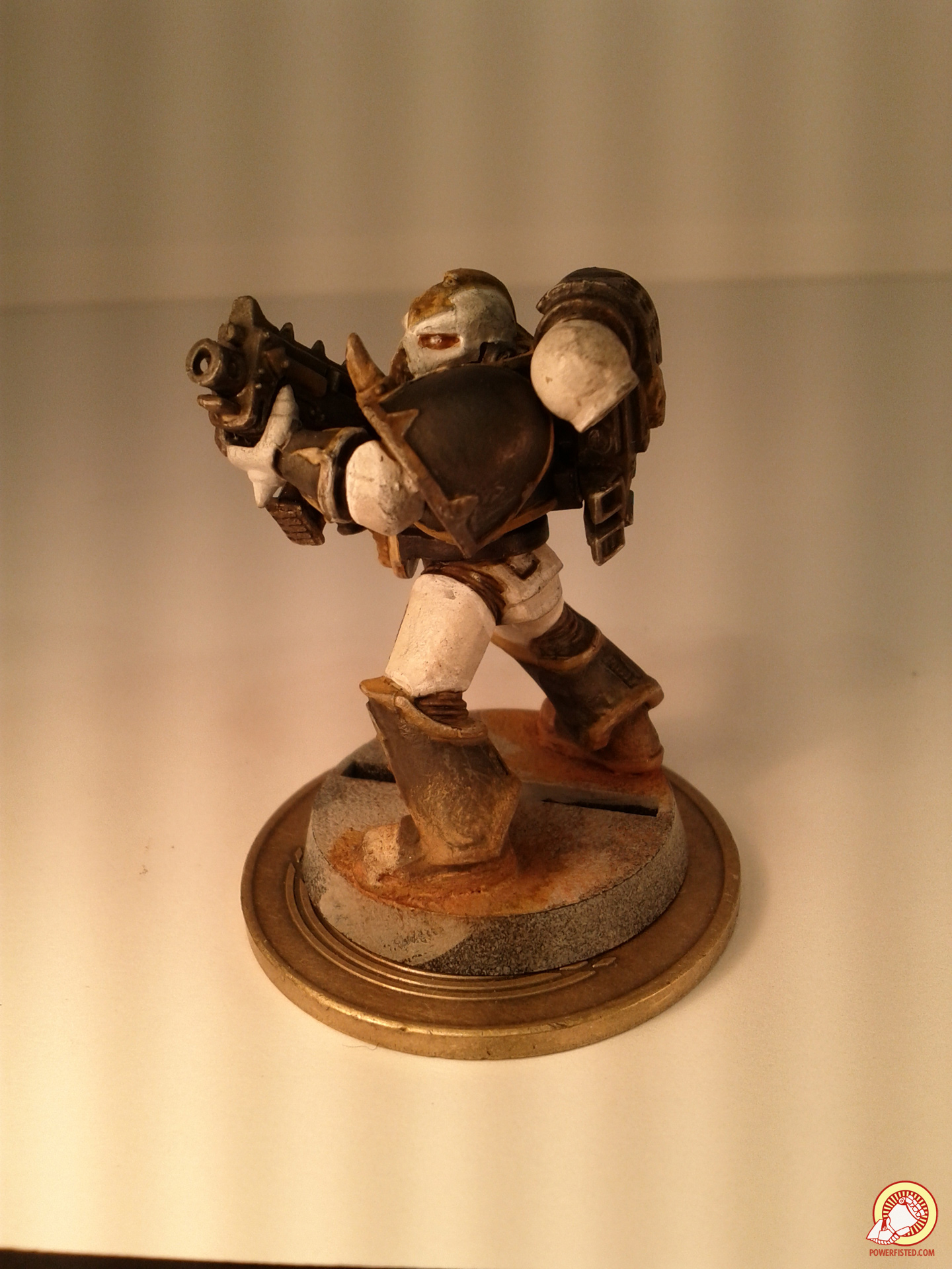
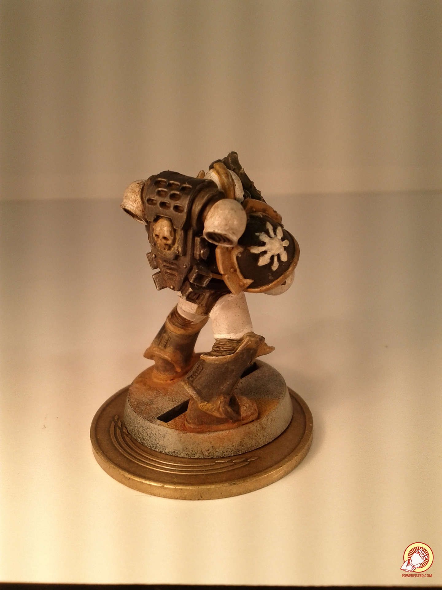
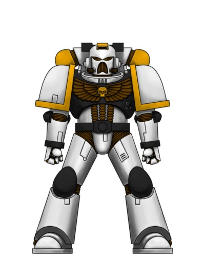
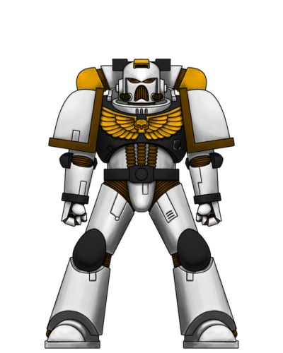
I learned that white is a bitch to paint, that it’s hard to highlight white, and that it felt like any model with white “pants”, “gloves”, and “boots” seemed a bit silly even though it looked snappy in a picture. Here’s one where I tried some highlights too:
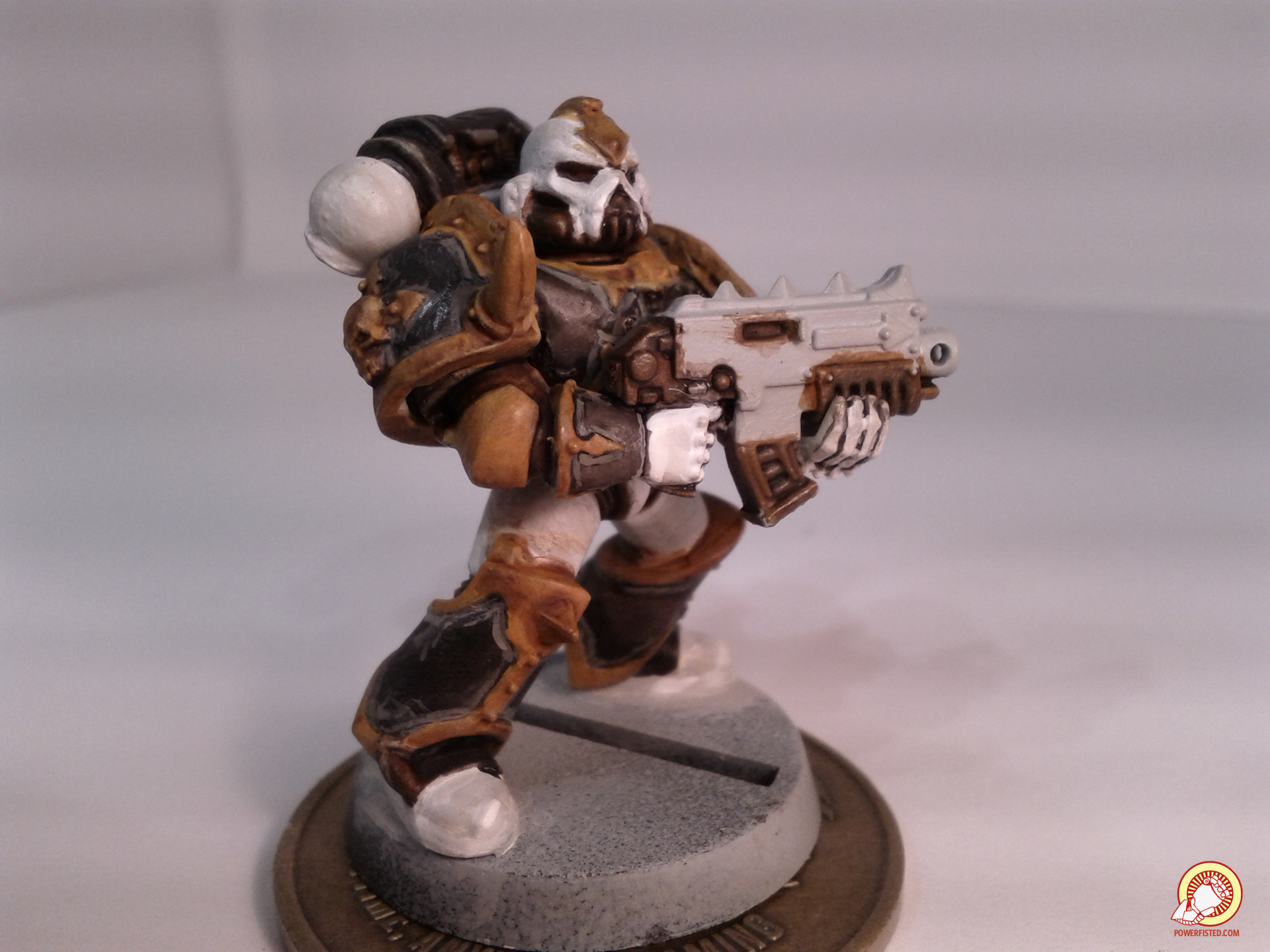
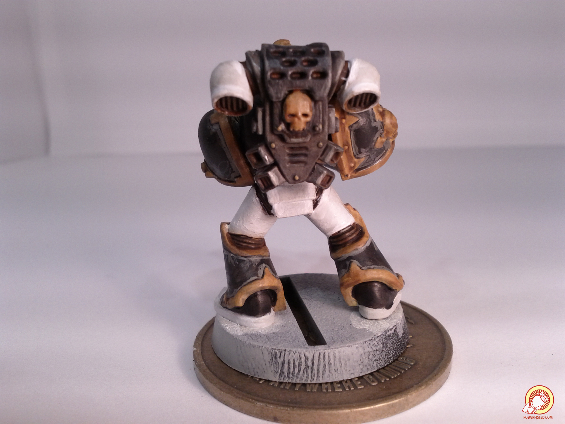
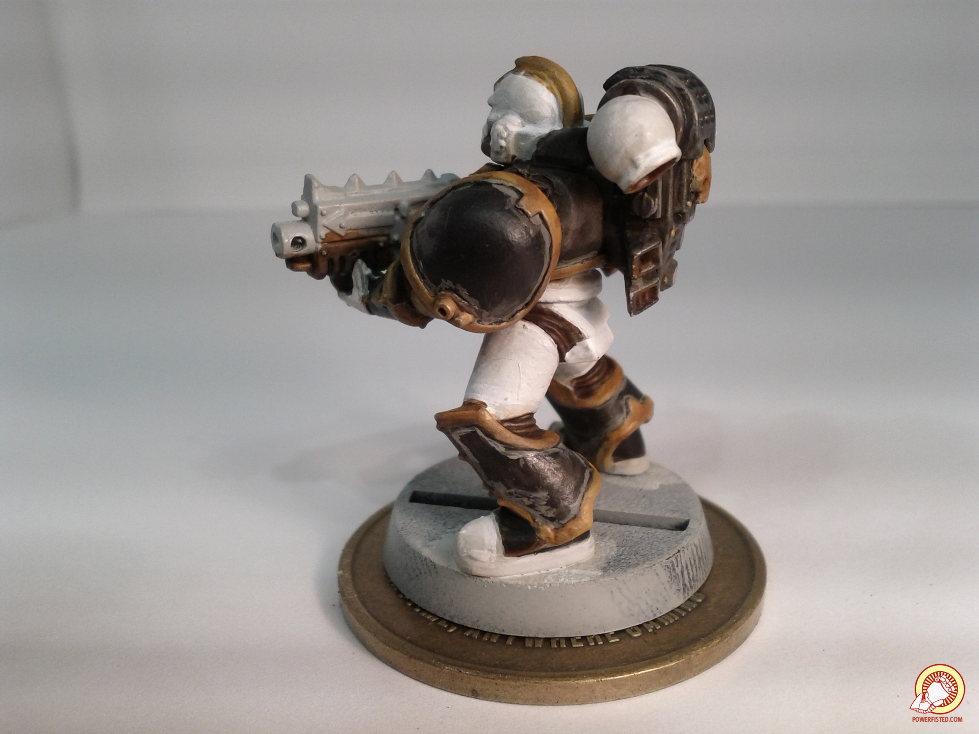
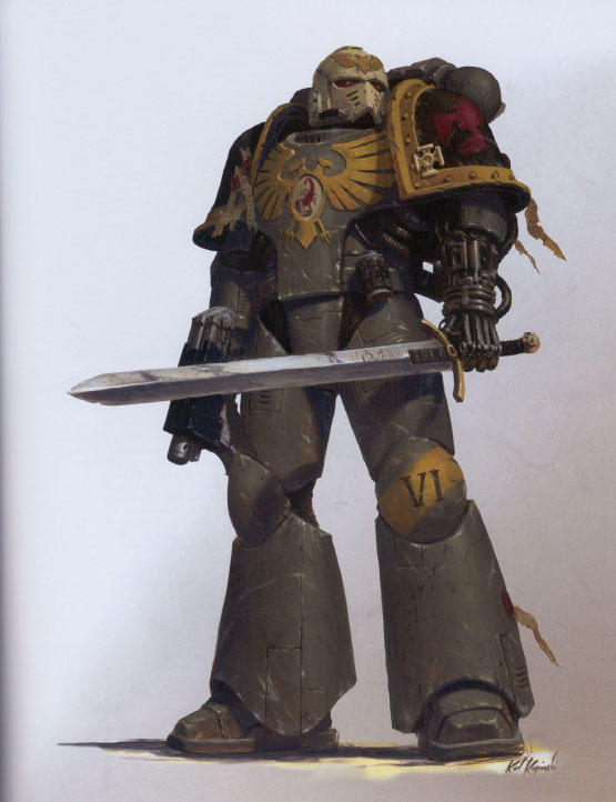
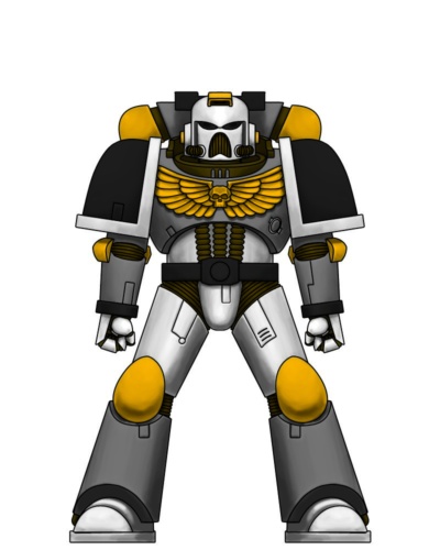
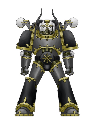
I decided that I needed to minimize my whites and maximize my dark colors, which were easier to paint, and stood out better. It was around this time that it dawned on me that the colors didn’t feel very metallic. For a space dude wearing iron space dude armor, he sure looked pretty flat and colorful. That’s when I saw this:
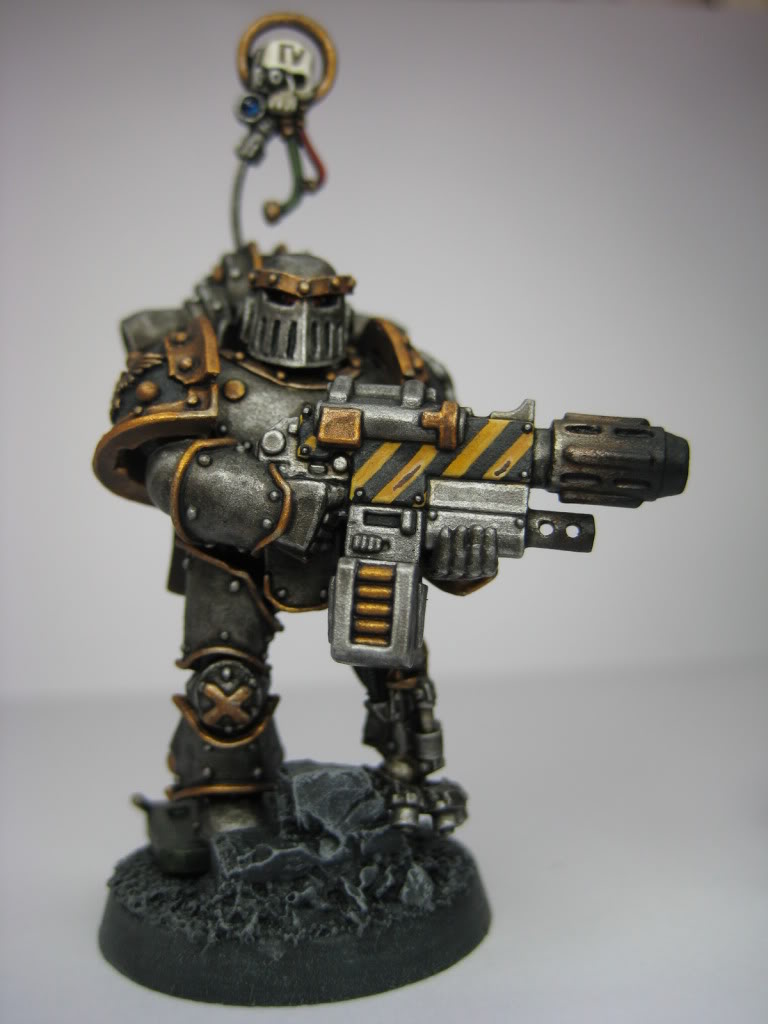
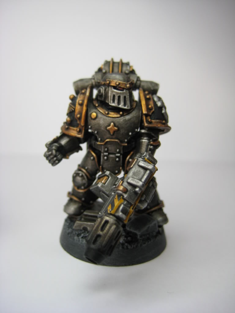
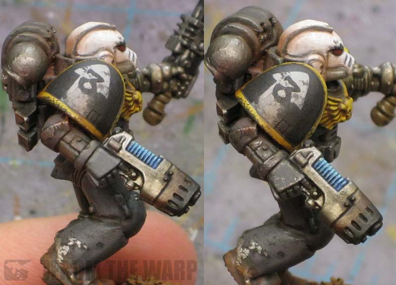
I love these models, and this is my hands down favorite Iron Warrior theme I’ve seen anywhere. The palette is perfect, the models pop, and everything looks metallic, clean, and practical. This artist’s stuff pushed me to learn metallic paints and develop skills to get near his amazing level of painting. I also found a blog that really kicked off my spiral of experimentation. Ron Saikowski’s From The Warp blog basically changed my painting life. He’s since stopped blogging, but his amazing tutorials and painting style really inspired and appealed to me- high in contrast, weathered, slightly cartoony, but mute in color palette yet crisp.
Ron might not blog anymore, but he is the absolute MAN. Thanks Ron, you are amazing. I learned a ton, and strove to get better thanks to you. I wanted results like yours and you helped me get somewhere near there:
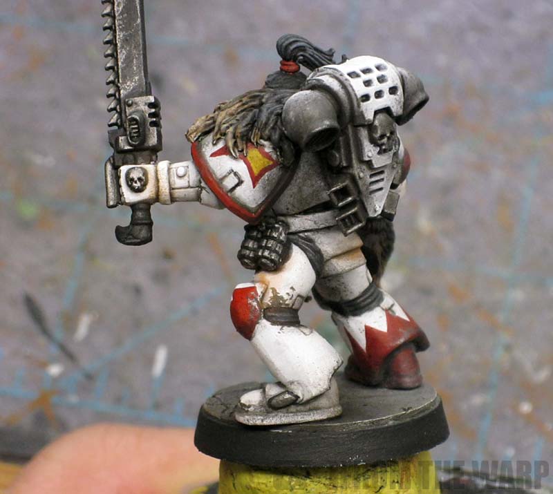
I took Ron’s style and mixed it with painting metal, oils, custom washes, airburshing, lead pencils, weathering powders, and a ton of other crazy new techniques that made me get way better. As I learned more ways to paint, I revised my technique, iterated, and finally revised my color theme one last time from all the things I learned:
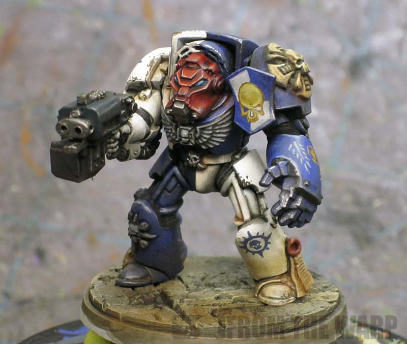
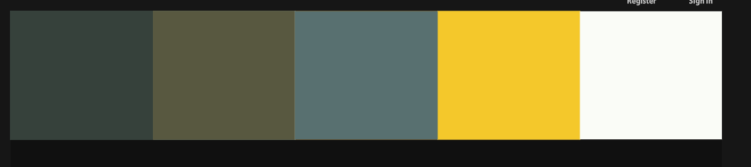
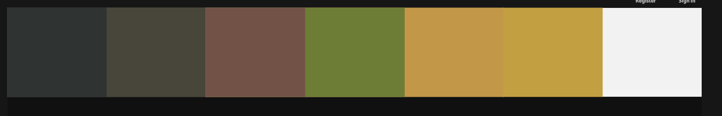
Did I stop there? Nope. No sir. The final thing that I did was realize I needed a palette of complementary colors. You see I had worked out a grey color I liked. My orange was taking shape. I really liked my blueish black… but I also had accessories and I wanted them to work well together. Especially when I started to paint bigger things. So, being the lazy guy that I am, I did a color analysis of the themes I liked the most, starting with the best painted red scorpions I could find:
… and that amazing metallic Iron Warriors theme:
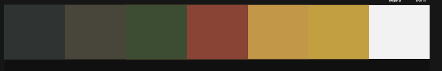
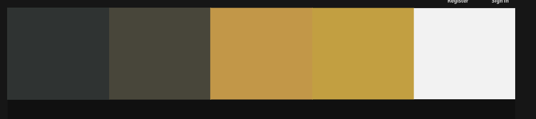
Which I combined, tweaked a bit, and began to use as the basis of my theme moving forward:
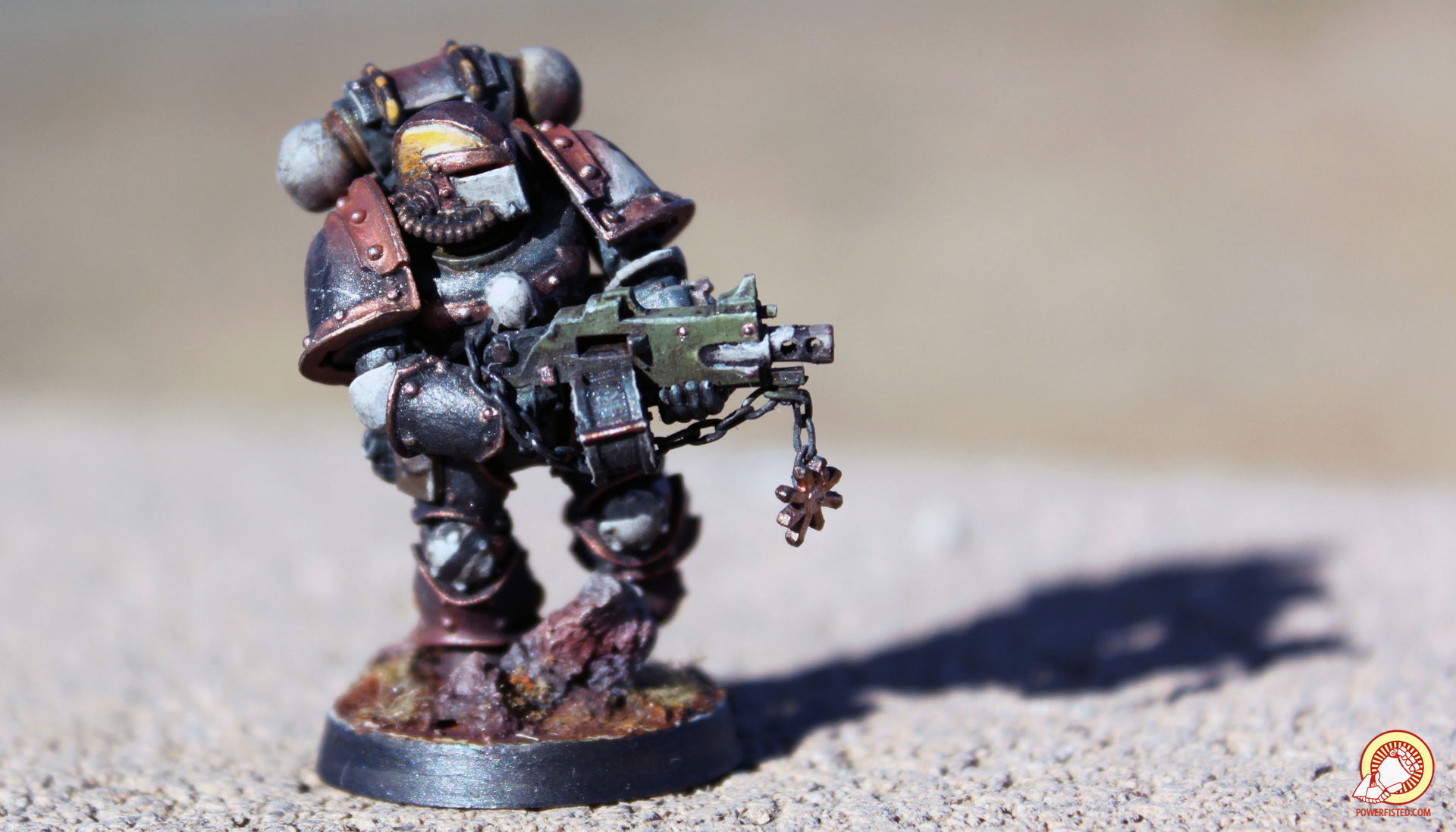
You can really see how it helped me down the road:
Pretty damn complicated right? You bet. I don’t recommend doing something this crazy for most folks. That said, being really meticulous up front helped me land a successful and unique color theme, which was exactly what I wanted.
Now I just have to paint the damn things 🙁